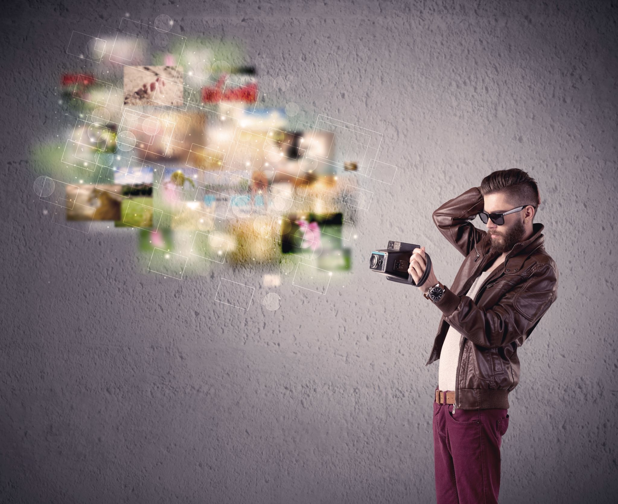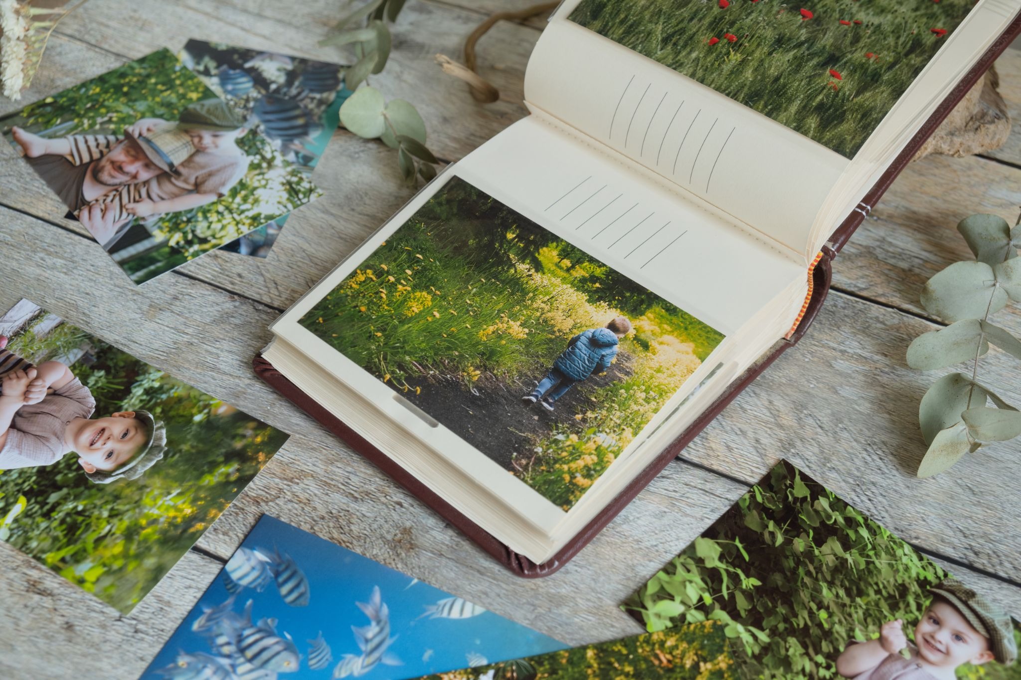
There is something profoundly different about holding a printed photograph in your hands versus scrolling past it on a screen. The weight of the paper, the richness of the ink, the way light falls across a printed image at different angles. These qualities create an experience that no screen has ever replicated and probably never will. A professional photo book takes that experience and elevates it into something even more significant. It is not just a collection of images. It is a curated narrative, a physical object that tells a story with intention, craft, and permanence. Whether you are a working photographer creating a portfolio to show clients, a wedding photographer delivering a final product that a couple will treasure for generations, or a fine art photographer building a body of work into a cohesive statement, the quality of your photo book reflects directly on the quality of your vision. Getting it right matters enormously, and it requires more than simply uploading your best images to a printing service and clicking order. This guide walks you through every stage of creating a professional photo book that genuinely does justice to your work.
Understanding What Makes a Photo Book Truly Professional
The word professional gets used loosely in photography contexts, but when it comes to photo books, it has a specific and meaningful definition. A professional photo book is one where every decision, from image selection to sequencing to paper choice to binding to cover design, has been made intentionally and in service of a coherent visual and narrative purpose. It is a book where nothing is accidental and nothing is arbitrary. The difference between a professional photo book and a consumer photo album is not primarily price, though price is often a consequence of the difference. It is intentionality at every level of the creation process.
Most photographers who attempt their first professional photo book make the same mistake: they treat the process as a printing problem rather than an editing and design problem. They focus on finding the right print service, the right paper stock, the right binding option, and they spend relatively little time on the decisions that actually determine whether the book succeeds as a visual and narrative object. The sequencing of images, the relationships between pages, the pacing of the narrative, the balance between density and breathing room, these are the decisions that separate a genuinely professional photo book from an expensive collection of nice photographs. Understanding this priority is the first and most important step.
The Narrative Architecture of a Great Photo Book
Every great photo book has a narrative architecture, a structural logic that shapes the viewer’s journey through the images. This architecture does not need to be a literal story with a beginning, middle, and end, though it can be. It can be thematic, moving through variations on a visual or conceptual idea. It can be emotional, building intensity and then releasing it. It can be rhythmic, alternating between different types of images in a pattern that creates visual music across the pages. What it cannot be is random. Random sequencing is the most reliable way to undermine even exceptional individual images.
Developing your narrative architecture begins before you open any design software. It begins with a deep and honest engagement with your image library. Spread your strongest images on a table, physical prints if possible, or on a large digital workspace if not, and begin looking for the natural groupings, the visual rhymes, the emotional progressions, and the thematic threads that connect them. These patterns are the raw material of your narrative architecture. Your job as the creator of a professional photo book is to make those patterns visible and meaningful to a viewer who is encountering the work for the first time.
Knowing Your Audience and Purpose Before You Begin
A professional photo book created as a client deliverable for a wedding has different requirements than one created as a fine art portfolio for gallery submission. A travel photography book intended for commercial licensing has different needs than a personal documentary project shared with a close community. Before you make a single design decision, you need to be clear about who this book is for and what you want it to do.
Curating and Editing Your Images With Ruthless Honesty
Image curation is the hardest part of creating a professional photo book, and it is the part that most photographers resist most strongly. It requires saying no to images you love, images you worked hard to capture, images that matter to you personally, because they do not serve the narrative and visual coherence of the book. This ruthlessness is not cruelty to yourself. It is respect for the viewer and for the work itself.
The general principle of professional photo book curation is that one weak image weakens every image around it. A viewer’s trust in the quality and intentionality of a book is built incrementally across its pages, and a single image that feels out of place, technically inferior, or narratively disruptive breaks that trust in a way that is surprisingly difficult to rebuild. Editing for a professional photo book therefore requires a higher standard than editing for any other purpose. Every image that makes it into the final selection needs to genuinely earn its place.
A useful approach is to edit in multiple passes with increasing severity. In the first pass, eliminate any images that fail on technical grounds: poor focus, significant exposure problems, or distracting compositional elements that cannot be corrected in post-processing. In the second pass, eliminate images that are strong individually but do not add anything to the narrative or thematic development of the book. In the third pass, look at what remains as a collection and ask which images are doing the most essential work and which could be removed without the book losing something irreplaceable. This progressive refinement consistently produces tighter, more powerful selections than trying to make all these judgments simultaneously.
Managing Color Consistency Across the Collection
Color consistency is one of the technical hallmarks of a professional photo book, and it is also one of the most commonly neglected elements in amateur photo book production. When images with significantly different color casts, tonal ranges, or saturation levels appear on adjacent pages, the visual discontinuity disrupts the viewer’s immersion in the work and creates an impression of technical carelessness regardless of the individual quality of the images involved.
Managing color consistency begins in post-processing. Developing a cohesive editing style for the images in your book, rather than processing each image independently according to its individual characteristics, is the foundation of visual coherence across a collection. This does not mean that every image must look identical. It means that the color palette, the tonal range, and the stylistic choices that define your editing approach should be consistently recognizable across the book as expressions of a unified visual language.
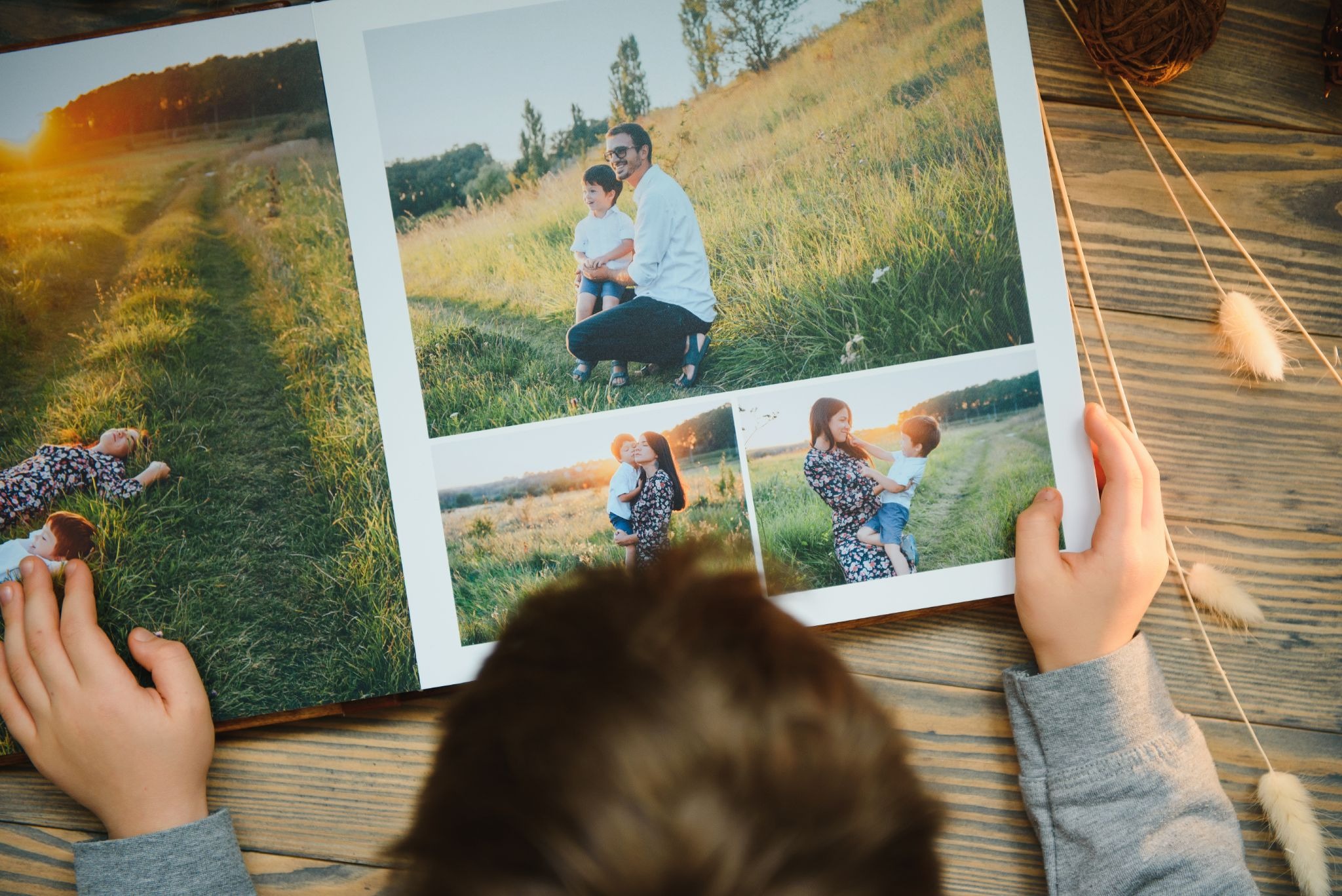
Designing Your Photo Book Layout With Intention
Layout design is where the narrative architecture you have conceived begins to take physical form. Every decision about how images are placed on the page, what size they appear at, how much white space surrounds them, and how they relate to the image on the facing page contributes to the viewer’s experience of moving through the book. Professional photo book design is not about using every available feature of your design software. It is about using restraint and consistency to create a visual environment where the images can speak as powerfully as possible.
The fundamental principle of professional photo book layout is that the design should serve the images, not compete with them. Overly complex layouts, excessive use of multiple images per spread, elaborate decorative borders, and aggressive typography all have one thing in common: they draw attention to themselves rather than to the photographs. The best professional photo book layouts are often the simplest, giving each image enough space to breathe and enough visual context to communicate its intended emotional and narrative content.
Working With Spreads as the Primary Design Unit
In photo book design, the spread, the two facing pages visible when the book is open, is the primary design unit rather than the individual page. Viewing a photo book is an experience of seeing two pages simultaneously, and the visual relationship between the left and right pages of every spread shapes the viewer’s experience as much as the quality of any individual image. A professional photo book designer thinks in spreads rather than in pages, considering how the images on both sides of the open book interact, contrast, and create visual dialogue with each other.
Strong spreads are built on deliberate visual relationships. A large dramatic image on one side paired with a smaller, quieter image on the other creates a dynamic tension that guides the eye and creates a sense of visual rhythm. Two images with complementary color palettes placed on facing pages create a sense of harmony and coherence. Two images with contrasting content or composition create a productive visual conversation that asks the viewer to think about the relationship between them. These relationships do not happen accidentally. They are the result of careful, deliberate placement that considers every spread as its own compositional problem.
Typography, Text, and When Words Serve the Work
Not every professional photo book requires text, and not every photographer should include it. Fine art photography books often work most powerfully with minimal or no text, allowing the images to communicate without verbal mediation. Documentary and travel photography books frequently benefit from contextual text that provides factual grounding for the visual narrative. Portrait and wedding photography books may include personal captions, dates, or brief narratives that add emotional depth to the images. The decision about whether and how to incorporate text should be driven by what genuinely serves the work and the viewer, not by a desire to fill space or demonstrate thoroughness.
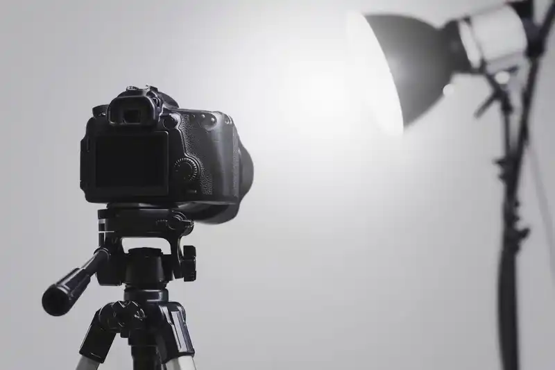
Choosing the Right Printing Partner and Specifications
The physical production of your professional photo book is where your design vision meets material reality, and the choices you make at this stage determine whether that meeting is triumphant or disappointing. There is an enormous range of professional photo book printing services available, from high-volume consumer services to boutique artisan printers, and the differences between them in terms of print quality, paper options, binding quality, and color accuracy are genuinely significant.
For a truly professional photo book, you need a printing partner who works with professional-grade equipment, offers ICC profiles for soft proofing, provides a wide range of paper options including fine art papers, offers multiple binding options, and is willing to communicate with you in detail about the technical requirements of your project. Consumer photo book services, however sophisticated their online design tools may be, are generally not capable of meeting these requirements. The investment in a professional printing partner is significant, but it is the difference between a book that looks professional and a book that merely looks expensive.
Paper Stock Selection and Its Impact on Image Quality
Paper is the soul of a printed photograph. The same image printed on different papers can look like two entirely different photographs. Paper choice affects color rendition, tonal range, contrast, perceived sharpness, and the physical experience of holding and turning pages. Choosing the right paper for your professional photo book is one of the most consequential decisions in the production process.
Coated papers, which have a surface treatment that controls ink absorption, generally produce the sharpest images with the most vibrant colors and the widest tonal range. Within coated papers, the choice between gloss, satin, and matte finishes significantly affects the visual character of the printed images. Gloss papers produce the most saturated colors and the deepest blacks, but they also produce reflections that can interfere with image viewing in some lighting conditions. Matte papers produce softer, more muted colors that some photographers find more aesthetically aligned with fine art printing values, and they are essentially reflection-free. Satin finishes offer a middle ground that works well across a wide range of photographic styles.
Uncoated fine art papers, including cotton rag papers and baryta papers, are the choice of many fine art photographers for high-end professional photo books. These papers have a tactile quality and a tonal character that coated papers cannot replicate, and images printed on fine art papers have a visual depth and warmth that is immediately recognizable to anyone who has spent time with museum-quality photographic prints. They are also significantly more expensive and require more careful management of file preparation and soft proofing to achieve optimal results.
Binding Options and Their Meaning for the Reader
Binding is the element of physical book production that most directly affects the reading experience, and it is one of the dimensions along which professional photo books most clearly distinguish themselves from consumer alternatives. The binding determines how the book opens, how flat it lies when open, how durable it is over time, and what physical and aesthetic statement it makes about the nature of the work it contains.
Final Thought
A professional photo book is one of the most demanding creative projects a photographer can undertake, and it is also one of the most rewarding. It asks you to be not just a photographer but an editor, a designer, a storyteller, and a craftsperson. It asks you to see your own work with the clear, demanding eyes of someone who cares about it enough to be honest about what is strong and what is not. And when it comes together, when the sequence is right and the layouts breathe and the paper does justice to the light you captured, it produces something that no digital format can replicate. A physical object that carries your vision into the world and into the hands of the people who matter to you. That is worth getting exactly right.